
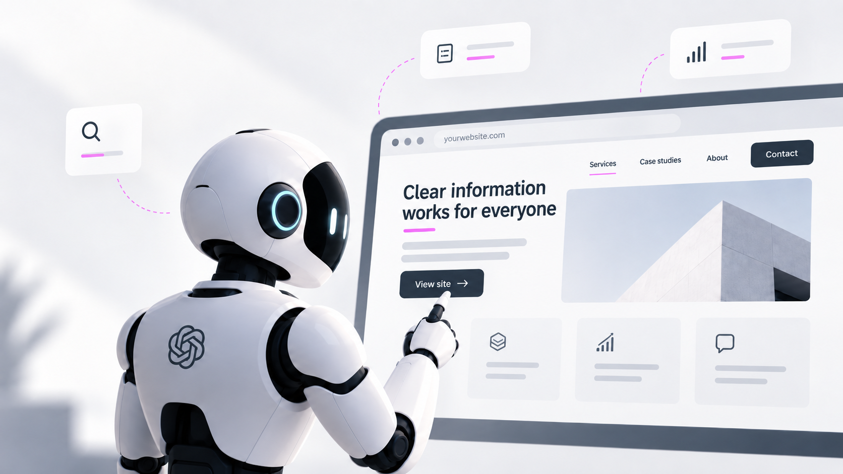



Every design decision on the web used to rest on one assumption: the person looking at the page is a person.
That no longer always holds. AI systems can browse websites, compare information, follow links and complete tasks for a user. Some work through the same visual interface you see. Others get more structured access to the information and actions behind it. Either way, your site now has a second kind of visitor, and it copes with vague design much worse than people do.
You don't need an “AI version” of your website. Most of what helps agents is what already made a site good for people: clear structure, descriptive labels, information stated outright, interactions that behave predictably. The difference is that agents leave you less room to get these wrong.
What changed
A person arrives with a lot of context. They know the logo probably goes to the homepage. They see three cards side by side and understand they're meant to be compared. They read the small line under a price as a condition, not a separate offer. When something is unclear, they guess, skim, go back and recover.
An agent has to turn the same interface into a series of decisions. Asked to compare two services, it has to work out which details belong to which offer. Asked to book a consultation, it has to find the button that actually starts that process. Asked to collect pricing, it has to decide whether the number includes setup, tax or a minimum commitment.
Agents can use ordinary websites fine. What changes is what ambiguity costs. A vague link label can send an agent to the wrong page. A pricing condition that is visually obvious but not tied to the number it modifies can end up misreported in a summary. A form that flags an error only by turning a field red may leave an agent with no idea what to fix. People have spent twenty years learning to forgive websites for this. Agents haven't.
Start with UX, not with a new file format
Whenever a new kind of visitor shows up, there's a rush toward new standards, files and protocols. That's rarely where the biggest problems are. Start with the question UX has always asked: can the visitor tell what's here and finish the task?
A menu item called “Solutions” is vague for a person and vague for an agent. So is a button labelled “Learn more”. A pricing table that only makes sense through colour and position asks both of them to reconstruct meaning you could have written down. These were already UX and accessibility problems. Agents just make them harder to shrug off.
A working rule: the more important the information or action, the less interpretation it should need.
Link labels have to work on their own
“Explore.” “Discover.” “See how.” “Get started.” These look tidy in a layout and say almost nothing. “View pricing” tells the reader more than “Explore”. “Book a consultation” is clearer than “Let's talk”. If five service cards each end in “Learn more”, a screen reader user hears the same link five times, and an agent has the same problem. Naming the service in the link fixes it for both.
That doesn't mean your copy has to sound robotic. The label just needs to make sense once it's pulled out of the design around it. Screen reader users have needed this for years.
Information has to hold up outside the layout
People read visual relationships without noticing them: the label belongs to the box below it, the asterisk points to the footnote, the checkmark in the third column means the top tier includes that feature. Machines can often infer these too, but inference is where mistakes creep in.
It matters most where someone is comparing options, checking eligibility or reading terms. If a service is only available in certain markets, say so in the text. If a price excludes implementation, put that statement right next to the price. If a case study result came from one specific engagement, name the engagement instead of trusting the layout to imply it.
The check is simple: copy the information out of the page. Does it still make sense?
Trust needs to be stated
People pick up credibility from soft signals: a polished site, familiar client logos, a good photo, a confident visual style. An agent comparing providers has little use for these. It needs answers it can extract. Who wrote this? What does the company claim, and what has it done, for whom, with what result? Where does it operate? When was the page last updated? What is the evidence?
This is where generic B2B copy gets exposed. “Trusted partner for digital transformation” reads fine in a hero section, but it gives an agent nothing to work with when it's comparing three providers against a brief. Named expertise, scope, numbers, process, constraints and specific examples give it something. A human buyer wanted those too. The agent just doesn't get swayed by a gradient.
Don't build for robots
Some teams will react by tuning pages for agents in ways that make them worse for people. SEO went through this phase, and plenty of technically compliant pages were miserable to read. There's no reason to repeat it.
Where human and agent needs overlap, which is most of the time, fix the underlying UX. Descriptive navigation, clear hierarchy, explicit pricing and useful error messages help both. Where they diverge, the two may eventually need different interfaces, especially once agents work through structured tools instead of the page itself. That's a separate design problem.
For now, most B2B companies don't need an agent-readiness project. They need to look at the site they already have and ask how much of it works only because people are willing to guess.
A quick test
Pick one important task on your website, such as requesting a quote, and strip out as much visual context as you can. Then check:
- Can you tell where each link goes from its label alone?
- Can you tell what each service is without reading the whole page?
- Is it clear which condition belongs to which price?
- Do you know what happens after a form is submitted?
- Can you tell a claim from the evidence behind it?
- Can you tell whether the information is current?
Every “no” is a problem that was already there. Agents didn't create it, they just don't cover for it. So the useful question isn't how to optimise for AI. It's how much of your site depends on people forgiving it.
Not sure which parts of your site only work because visitors guess? Our CRO, customer journey and digital experience audits find where a website loses attention, trust or conversion, and fix it.